Orange County Fashion Show Brochure & Branding
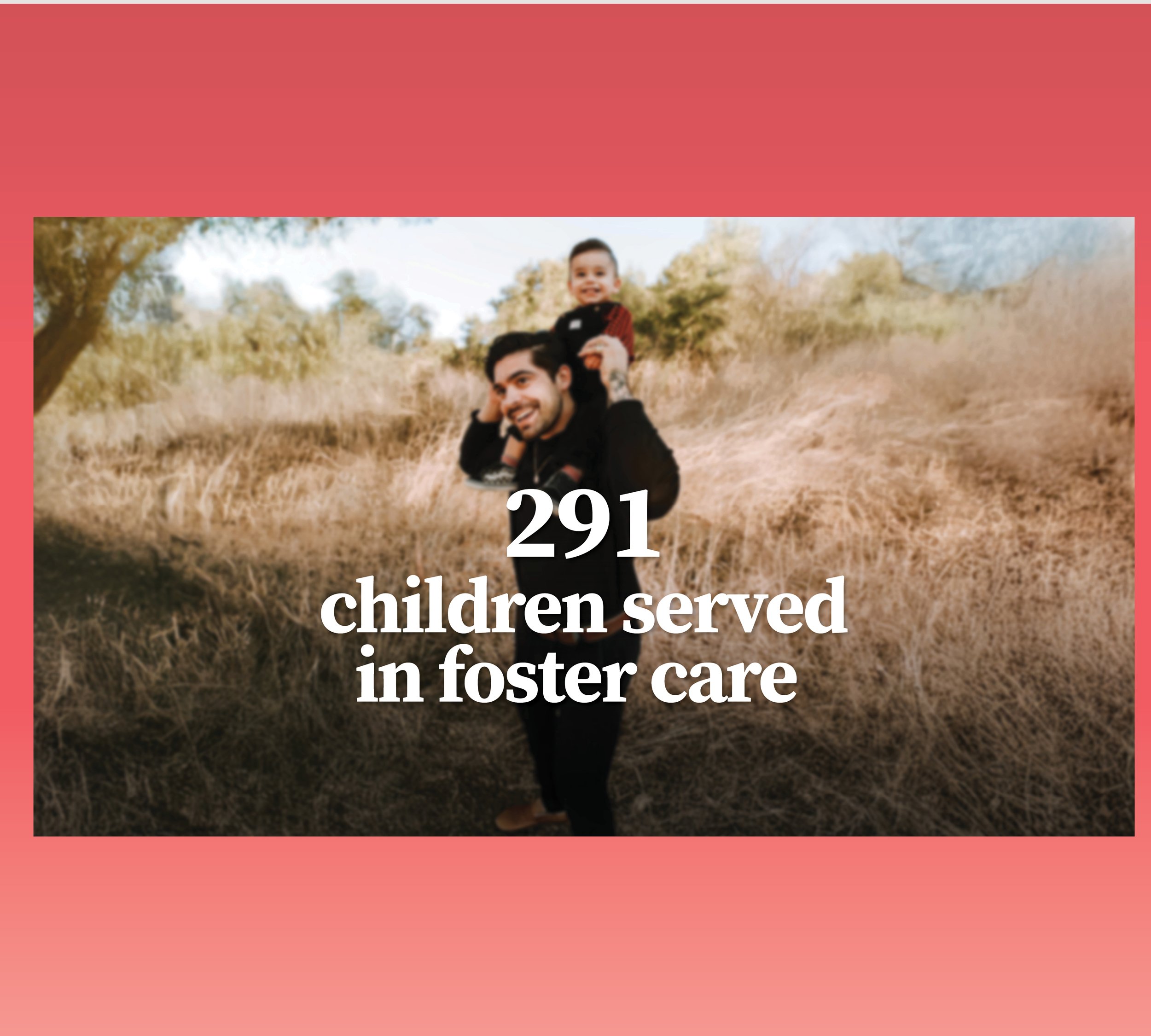
Childhelp is a national nonprofit dedicated to the prevention and treatment of child abuse. For their Orange County Fashion Show fundraising event, I designed a multi-page printed program that guided attendees through the event while highlighting sponsors, donors, and the organization’s mission.
Client
Childhelp
Year
01 / 2026
The Challenge
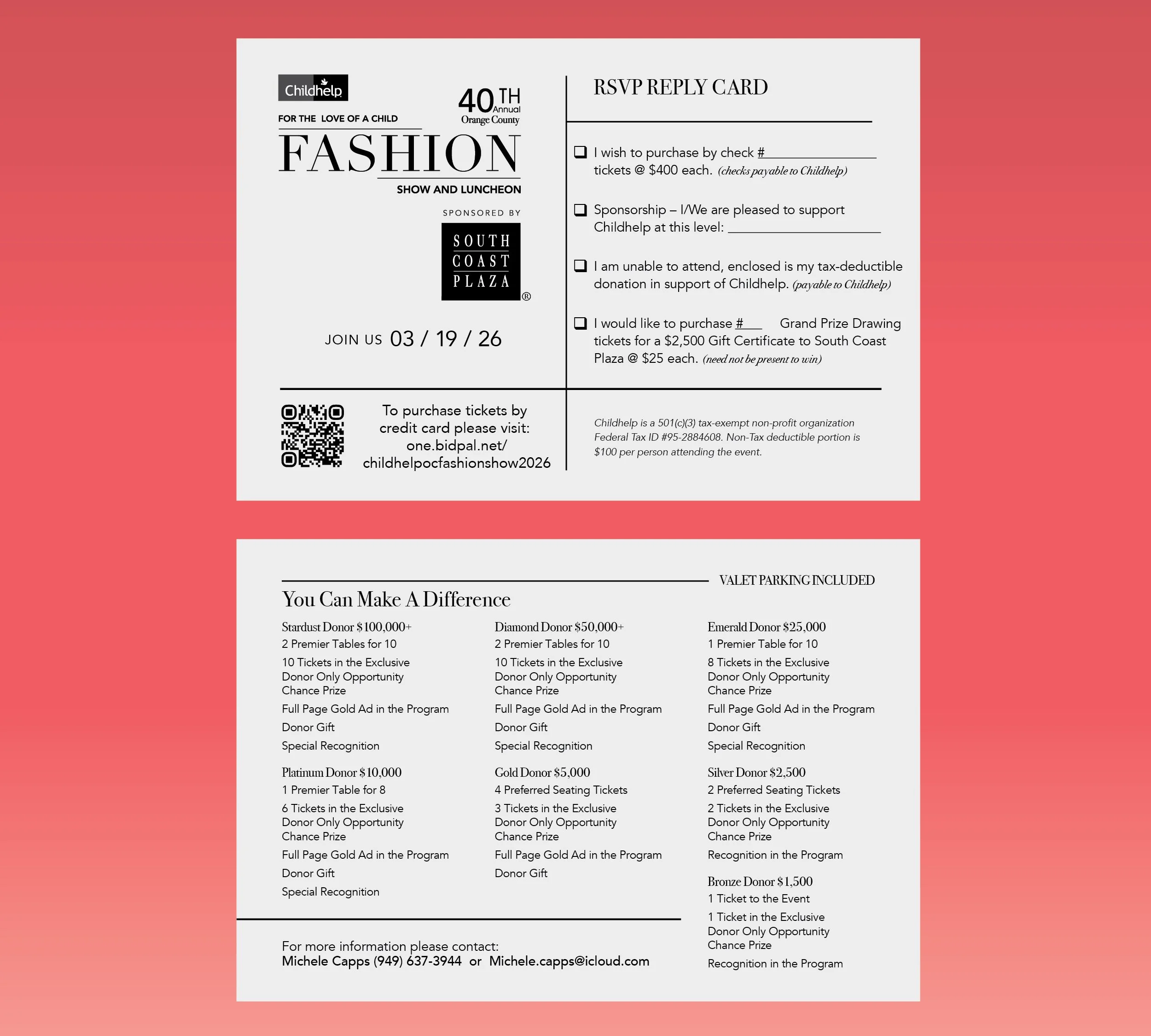
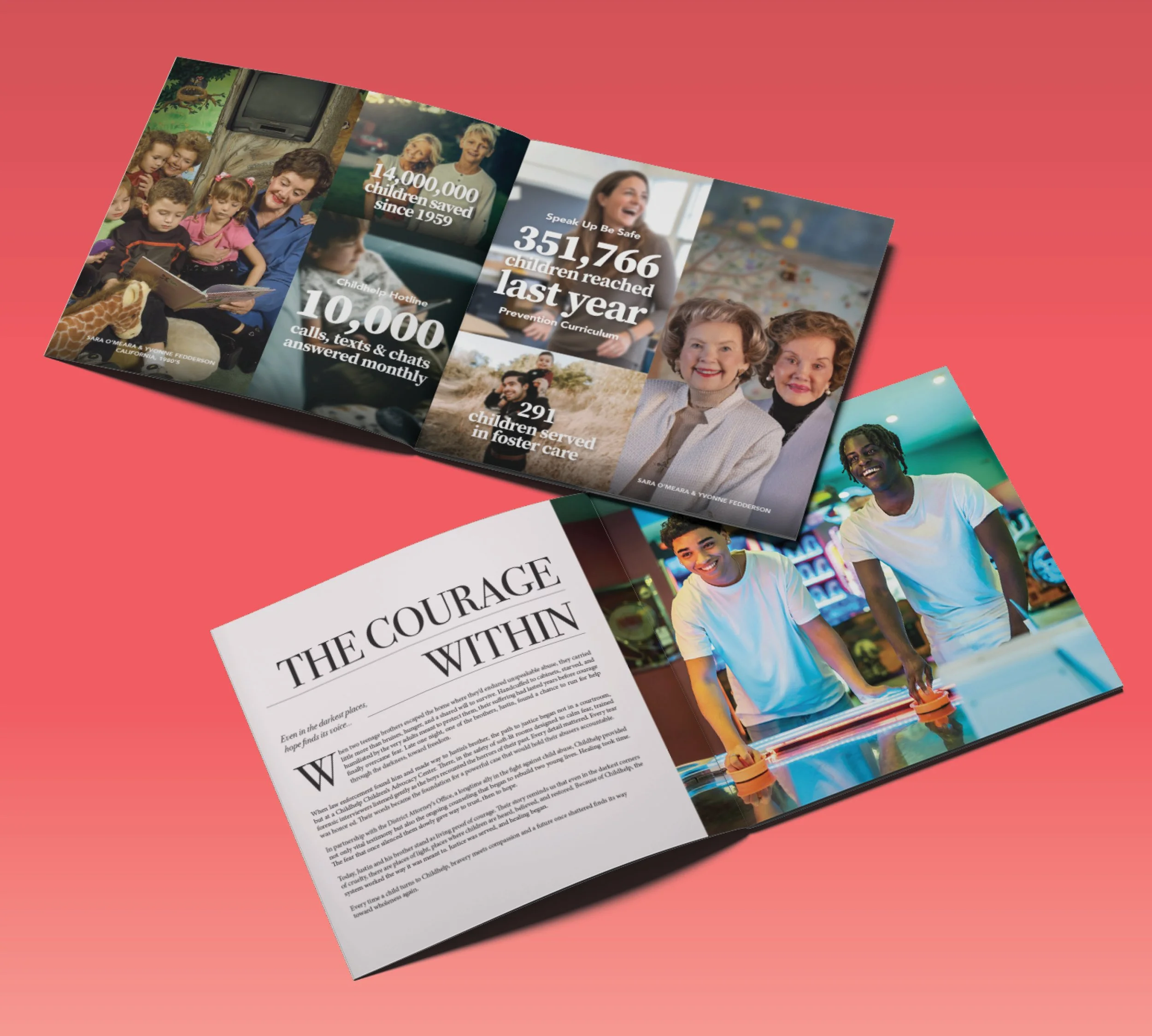
The Childhelp OC Fashion Show program needed to serve multiple purposes at once: guide guests through the event, highlight sponsors and donors, and reflect the elegance of a high-end fashion experience. Like many nonprofit events, the booklet required a large amount of information to be included while still feeling visually engaging and polished. The challenge was to organize dense content into a clear editorial layout that felt elevated and aligned with the style and energy of a fashion show.
The Followthrough
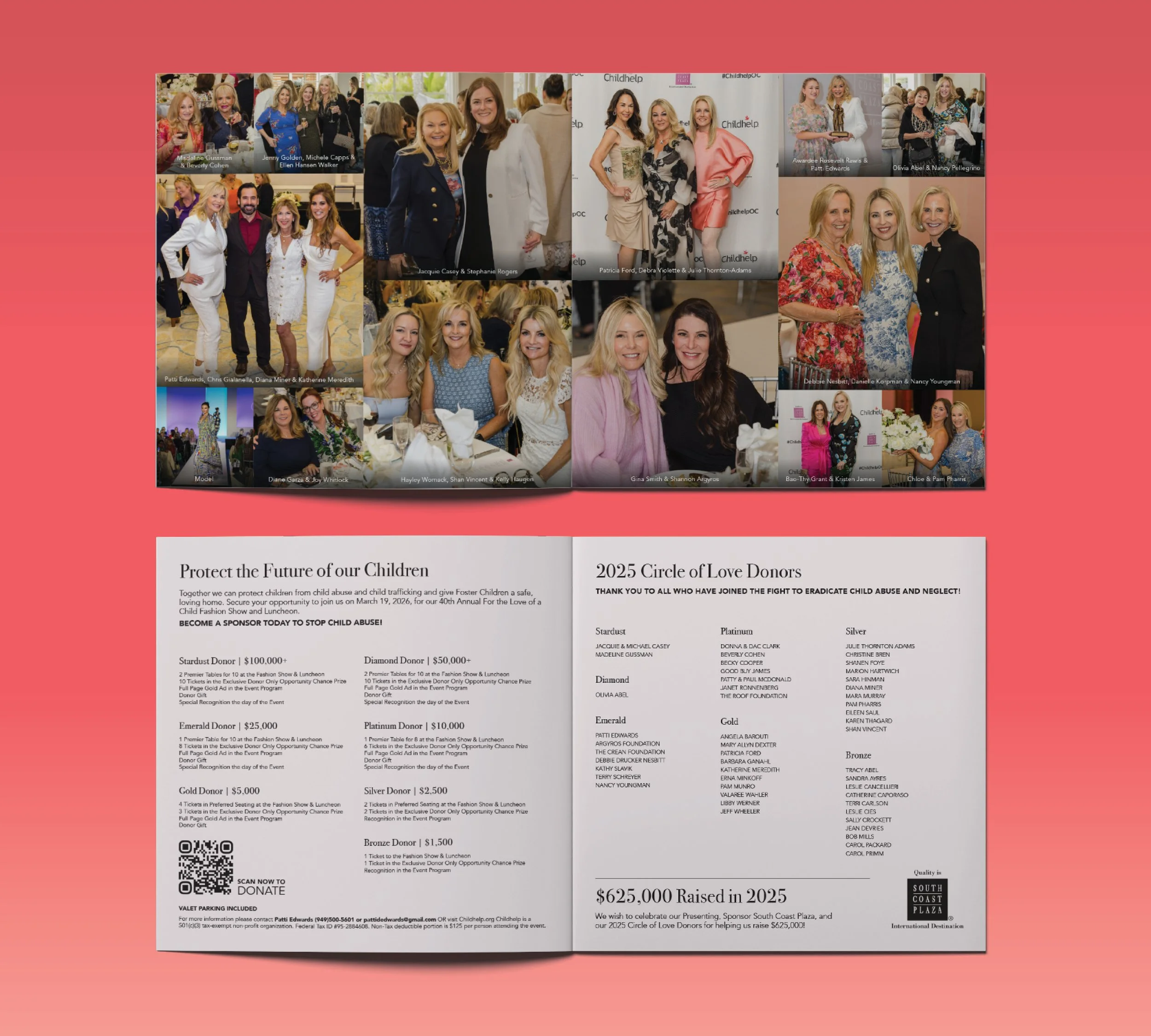
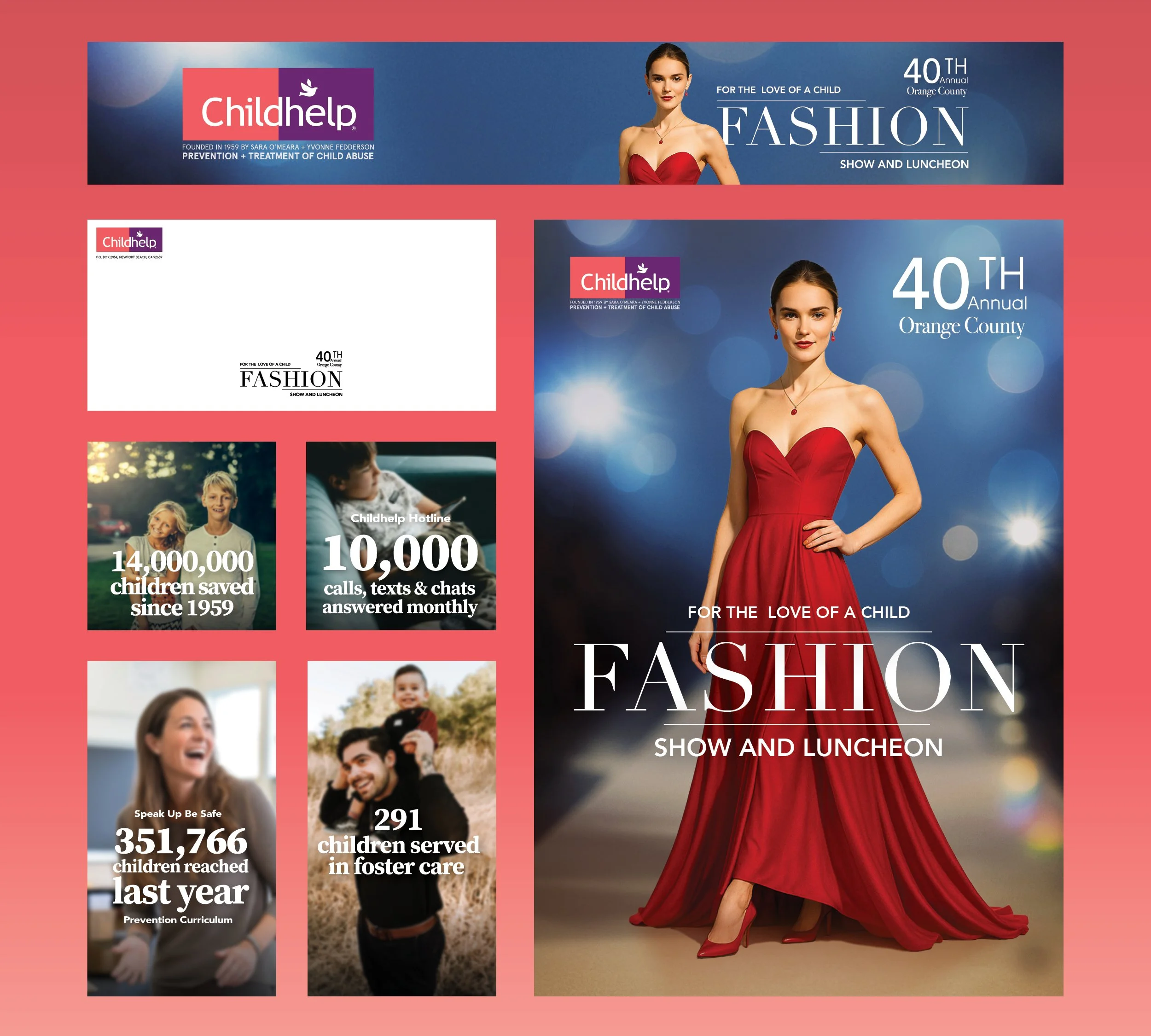
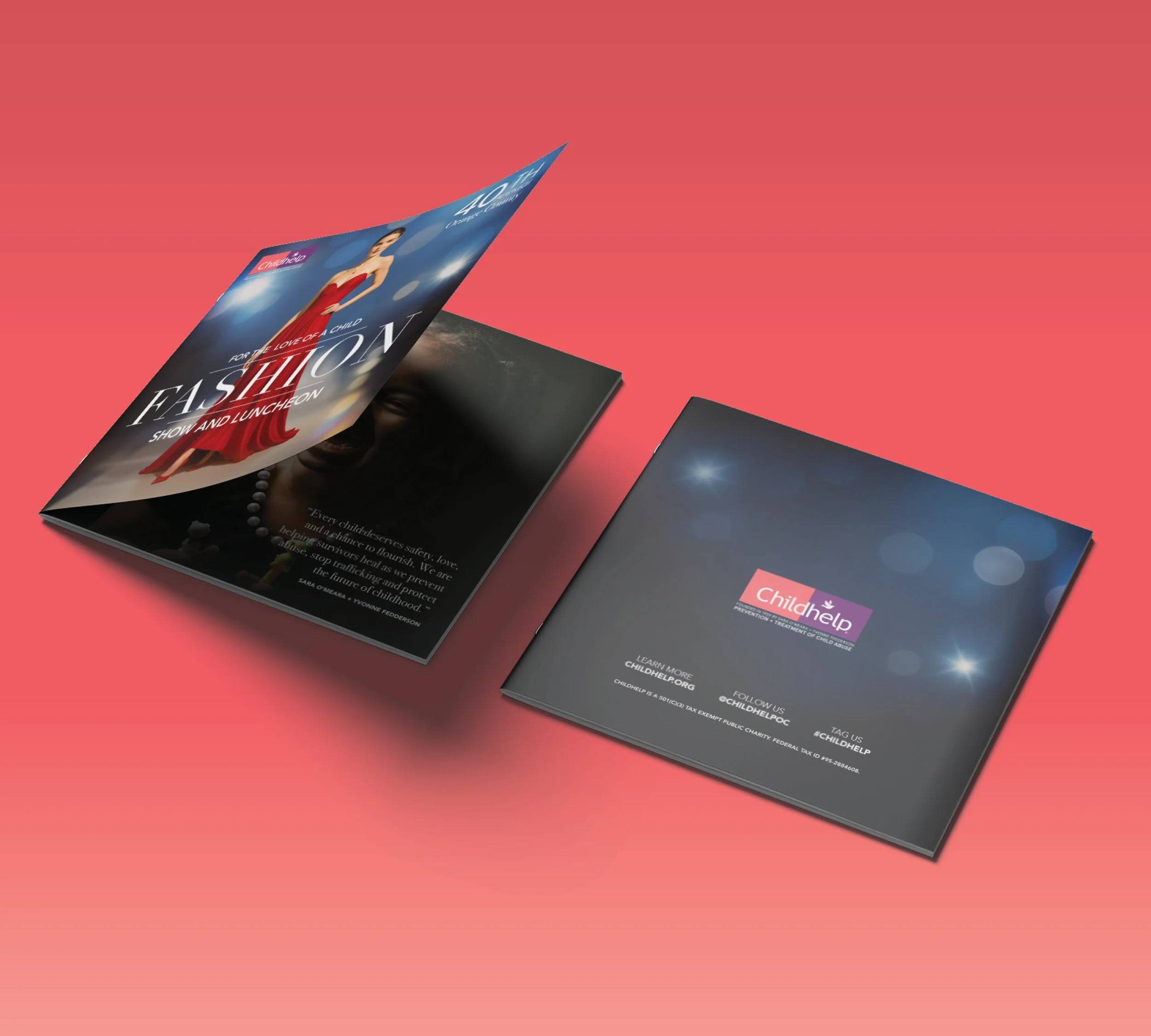
With the final cover image selected and the typography direction defined, I built out the rest of the program using a structured editorial layout system. The chosen type styles were applied across the booklet to create strong hierarchy and visual consistency while organizing schedules, acknowledgments, and sponsor placements. Once the core visual language was established, it allowed the design to expand naturally into the rest of the event collateral, including invitations, envelopes, social media posts, and the remaining pages of the brochure. This ensured that every touchpoint for the event shared a cohesive look and feel, reinforcing the elegance and professionalism of the Childhelp Fashion Show.
The Mindset
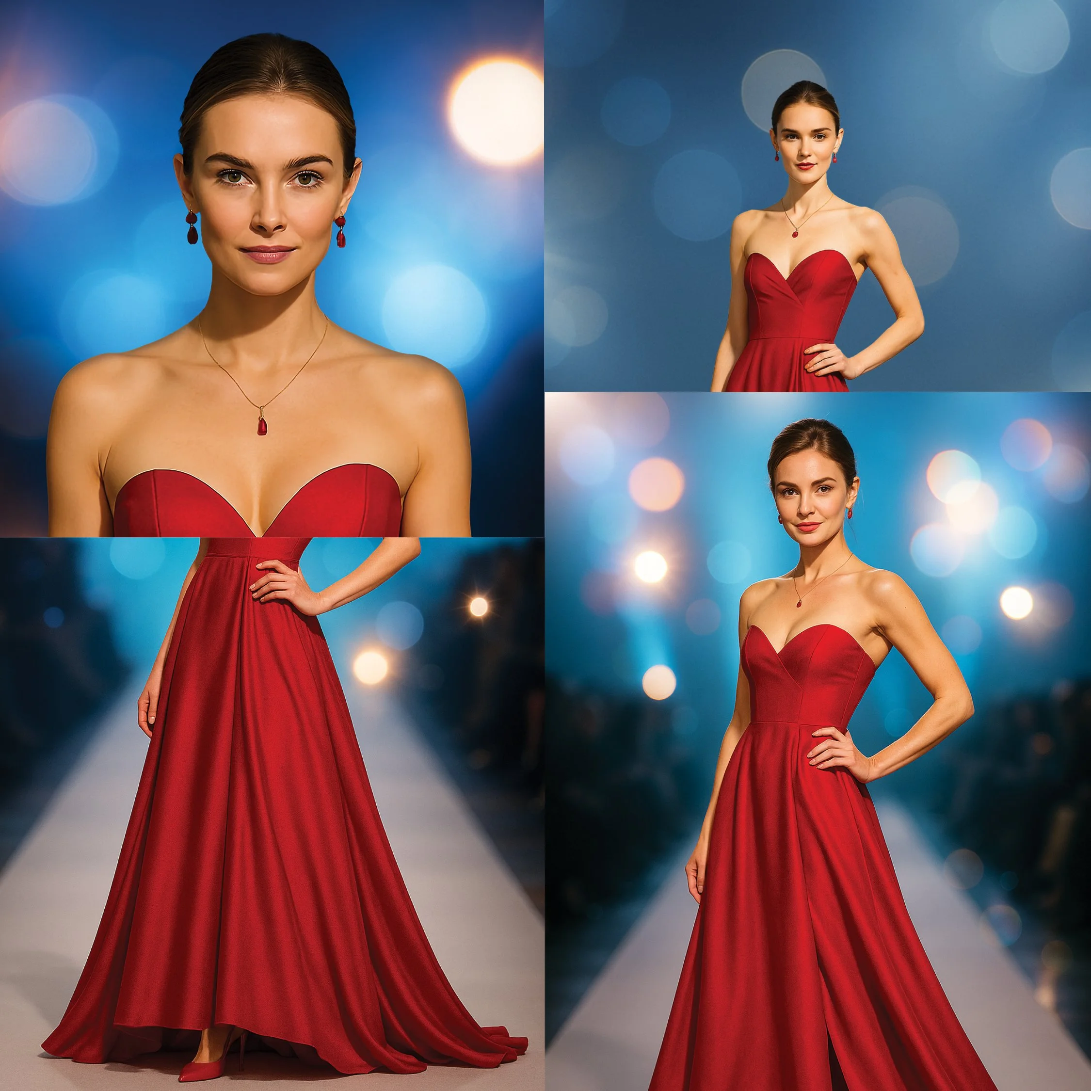
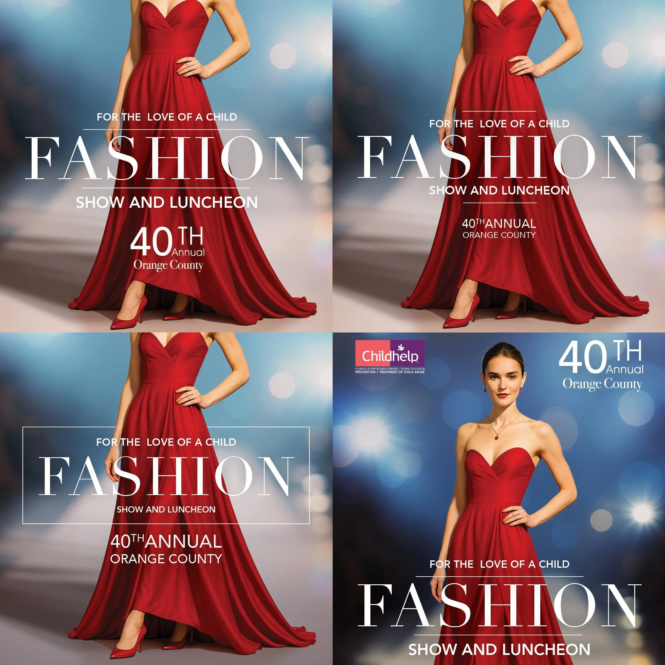
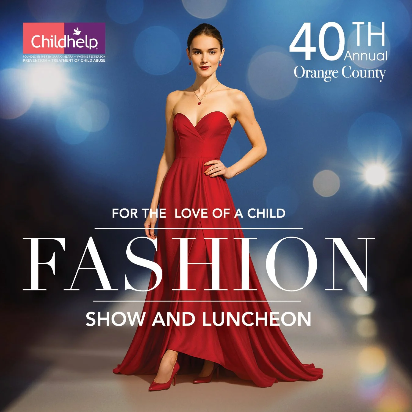
Working on a nonprofit timeline meant there were limited resources and very little time to produce custom photography for the cover or visual identity of the event. Instead of letting that limit the creative direction, I approached it as an opportunity to explore a new solution. I used AI-assisted image generation to create the main fashion model used on the cover, generating dozens of variations and refining the visual direction until the final image captured the tone and sophistication the event needed. Once the main image was established, I began exploring multiple typography directions to find a style that complemented the image and reinforced the elevated, fashion-forward feel of the event.
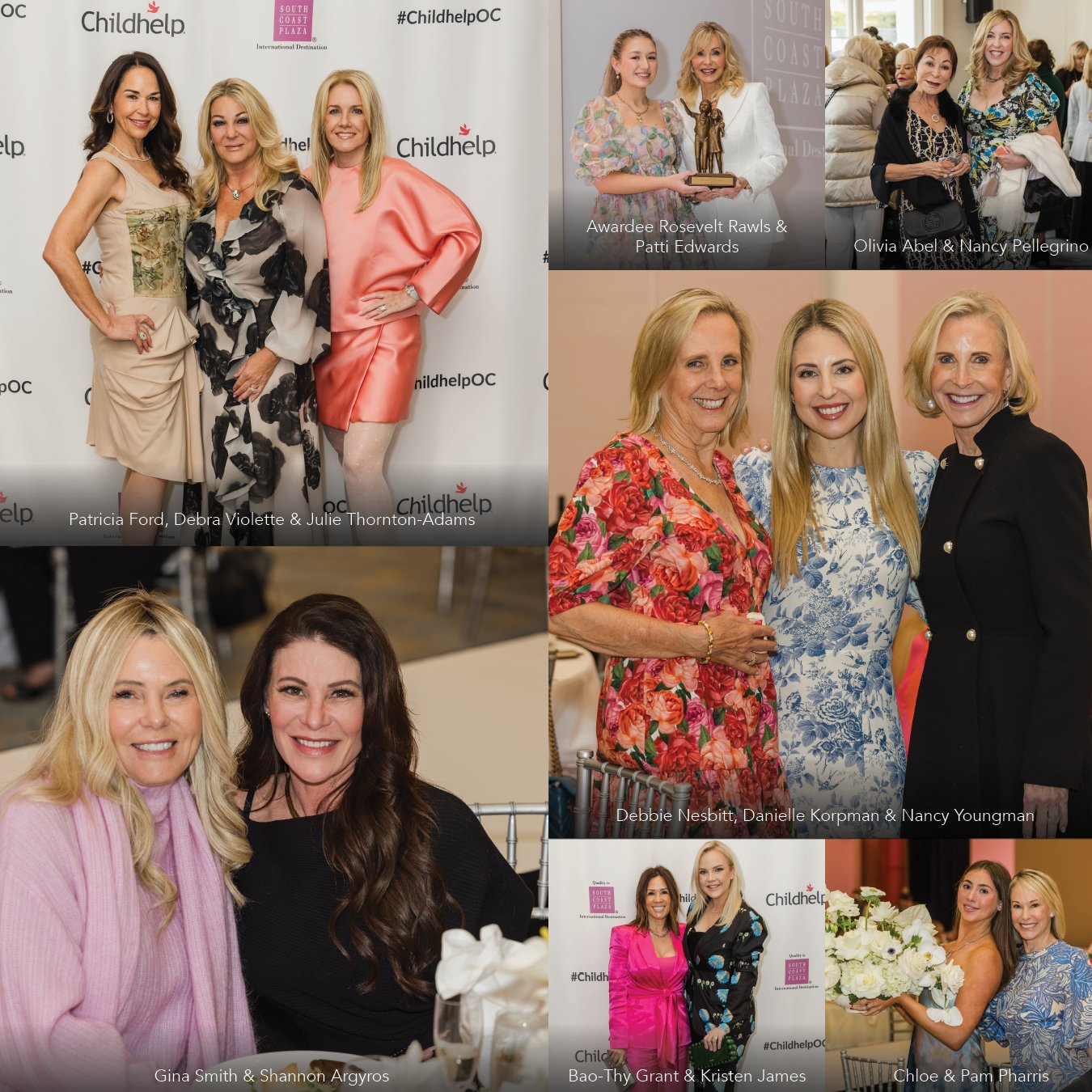
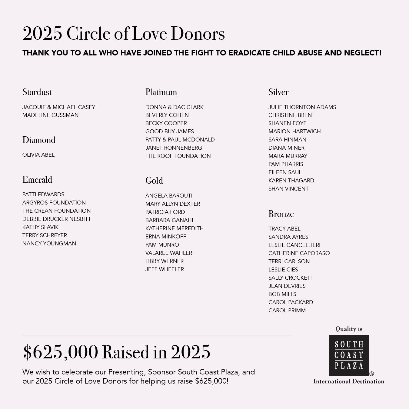
The Brochure


Supporting Deliverables